Editorial Brevia is a publisher with a unique mission: to explain big, complex topics in short, accessible books. The core challenge was to develop a brand identity that could communicate this duality, feeling both intellectually robust and beautifully simple. The goal was to create a brand that felt intelligent but not intimidating; a sophisticated yet approachable guide for the curious mind. I was tasked with creating this complete brand identity, the website, and a scalable design system for their core product: the book covers.
The primary challenge was twofold. First, to create a brand identity that visually encapsulated the “Big Topics, Short Books” promise. Second, to design a cover system for six diverse categories that was flexible enough to be distinct, yet rigid enough to feel like a cohesive family, all while being easily replicable for future titles.
Crafting an “Accessible Sophistication”
The brand identity was built on this key concept. The logotype “brevia*” uses an elegant, high-quality typeface set entirely in lowercase to feel modern and approachable, removing the intimidating barrier of traditional academic publishers. The asterisk (*) was introduced as a core brand element, symbolizing both the “footnote” to a complex topic and the “spark” of insight the reader gains. It visually represents the “plus” of understanding that Brevia provides.
Developing a Cohesive Cover System
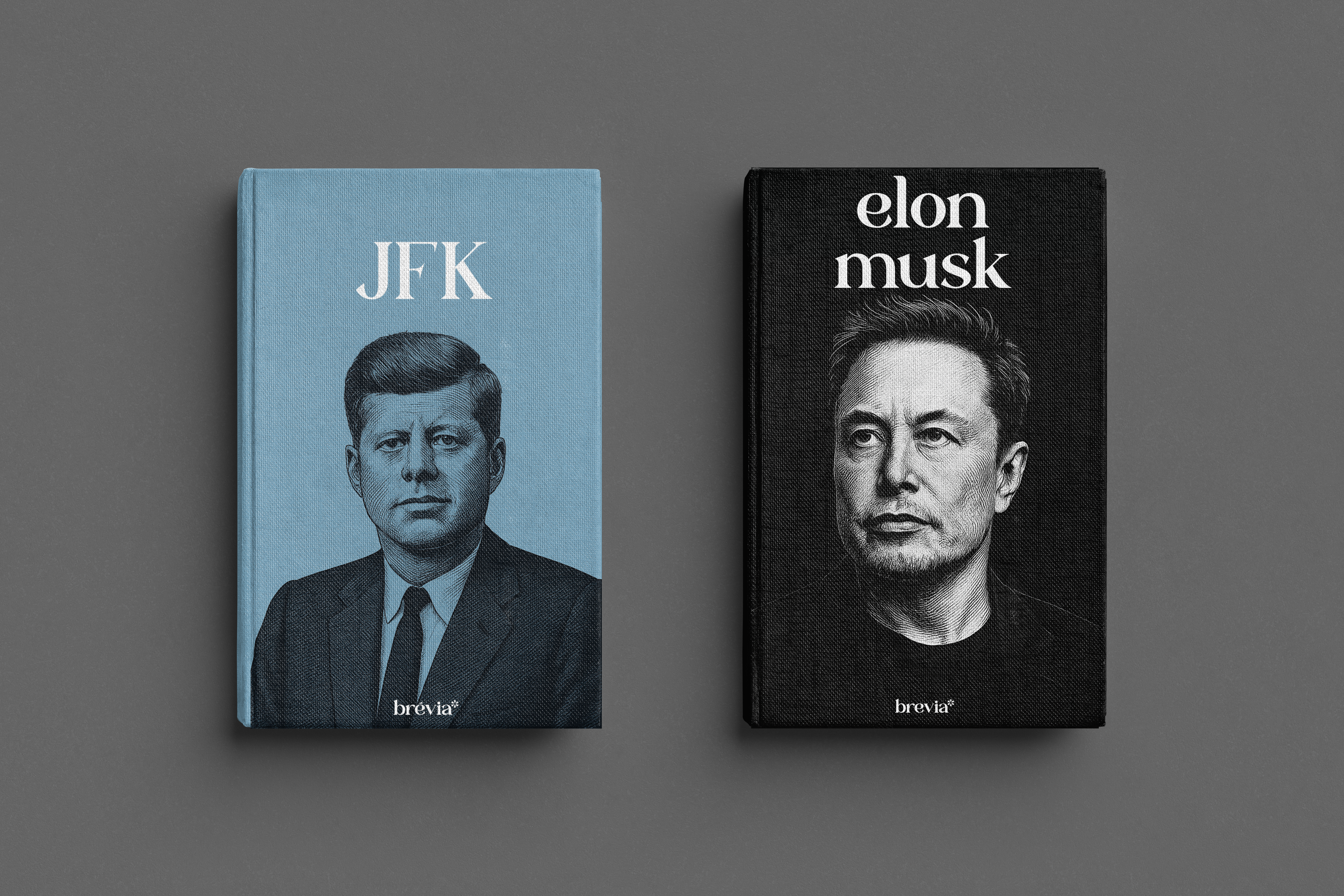
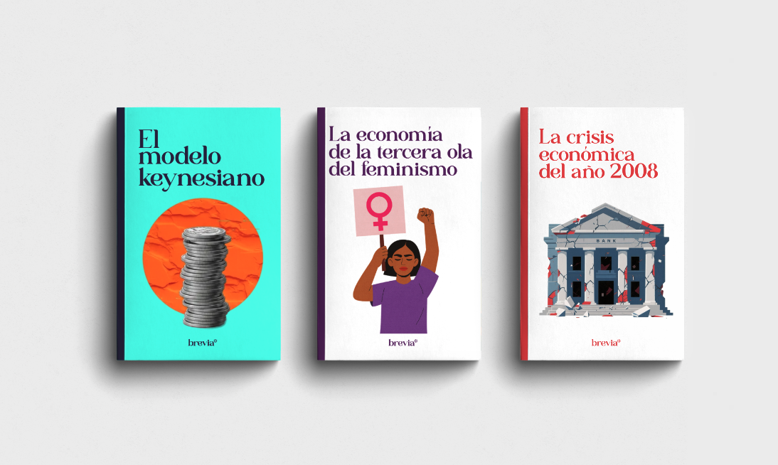
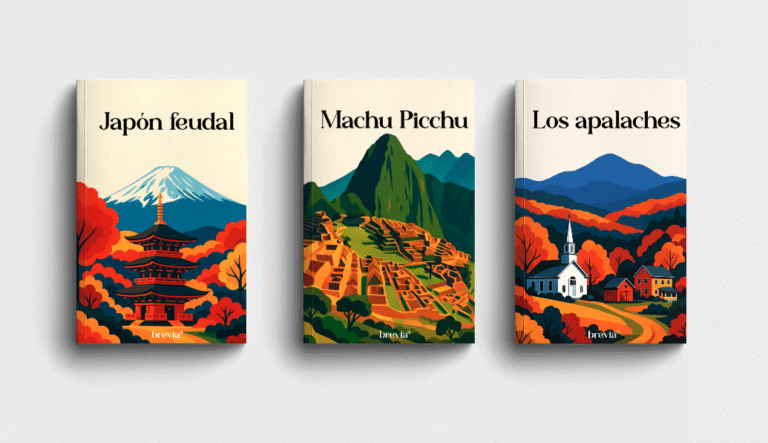
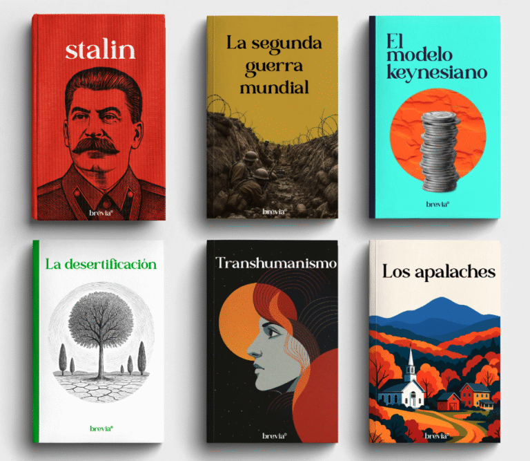
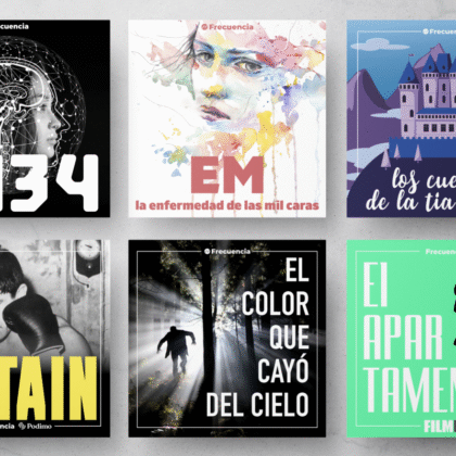
This brand philosophy was then extended to the products themselves. I created a design system where a unified brand core (logo placement, typographic hierarchy) ensures consistency across all books. To achieve variety, each of the six categories was assigned a unique visual anchor—such as powerful portraits for ‘Biographies’ or iconic photography for ‘History’—creating a system that is both diverse and instantly recognizable as “Brevia”.
Cohesion Through Consistency
While the key visuals differ, all covers share the same typographic hierarchy and logo placement, ensuring that whether it’s a book on JFK or Transhumanism, it is instantly recognizable as an “Editorial Brevia” book.
The result is a dynamic and scalable design system that allows Editorial Brevia to launch new books efficiently while maintaining a strong and coherent brand presence. The six distinct template styles give the publisher visual variety on the bookshelf, while the underlying system ensures brand recognition and loyalty. The project delivered a full brand guide, a functional e-commerce website, and a robust, future-proof system for their entire product line.