The primary challenge was to create a design framework that was rigid enough to be consistent, yet flexible enough to adapt to a diverse catalog of books. The approach was built on three core pillars:
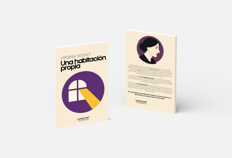
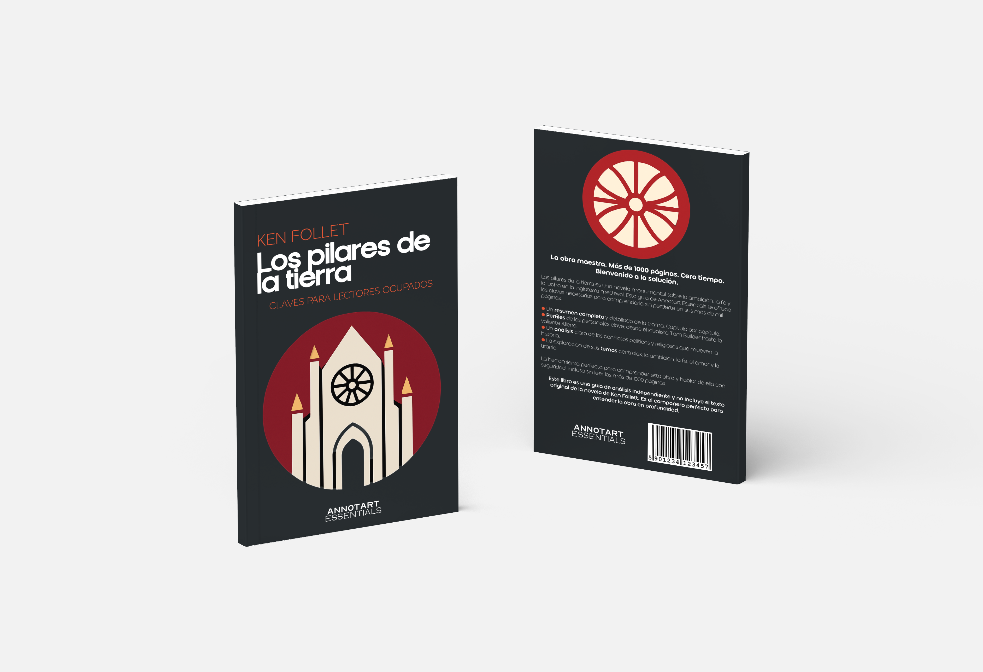
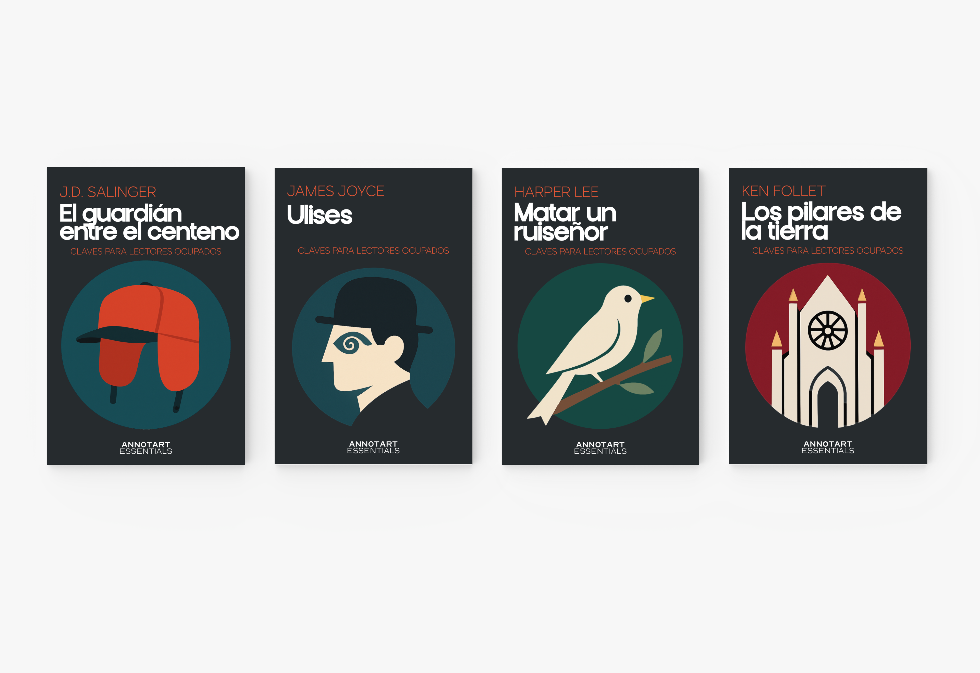
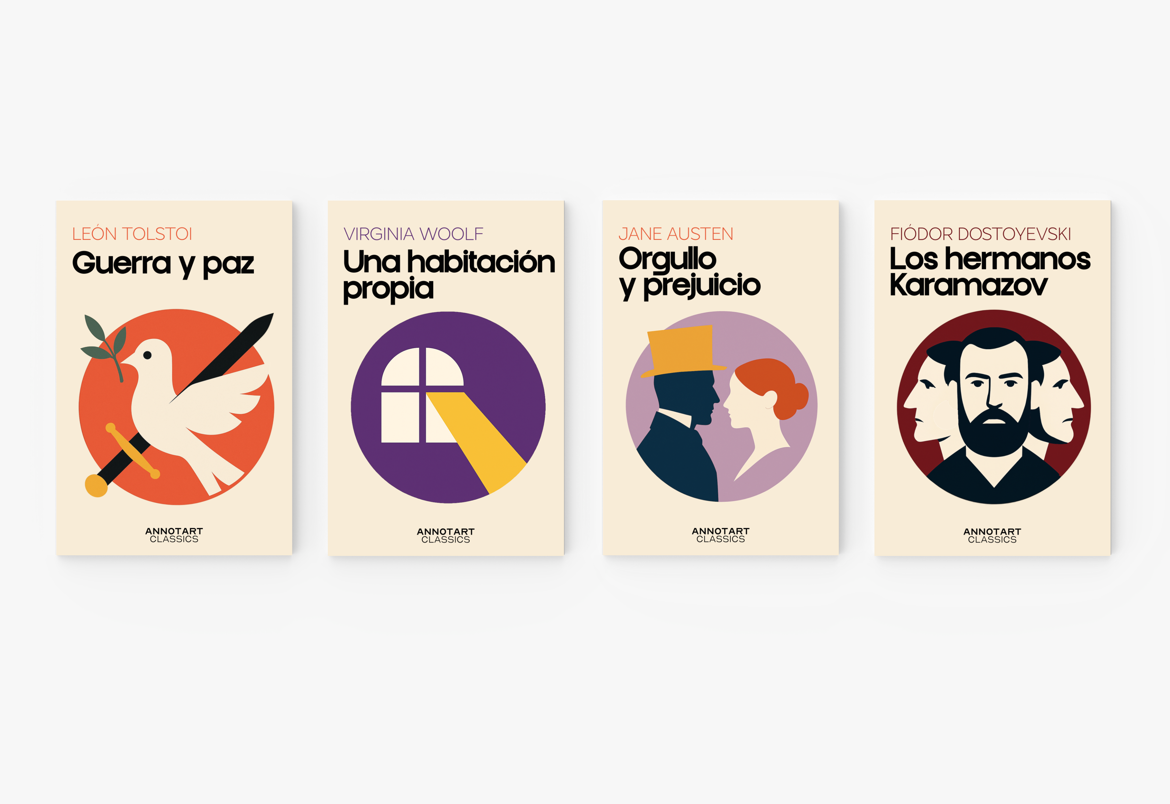
1. A Replicable “Icon” System: The heart of the visual system is a central, symbolic illustration contained within a simple geometric shape. For each book, its core themes are distilled into a single, minimalist icon (a dove and sword for War and Peace; a cathedral for The Pillars of the Earth). This creates a visually unified series where each book has its own unique, modern emblem, making the collection feel like a curated set.
2. Balancing Accessibility with Elegance: This crucial duality was achieved primarily through typography. A bold, modern, and clean sans-serif was chosen for the titles to feel fresh and approachable. This was contrasted with a more classic, spaced-out typeface for the author’s name, adding a touch of literary sophistication. The overall clean layout and generous white space remove the visual clutter often associated with classic editions, making them feel breathable and easy to approach.
3. Clear Identity for Two Product Lines: To instantly differentiate the two series while keeping them in the same family, a simple and effective color-coding system was established. “Annotart Classics” (full text + guide) uses light, cream-colored backgrounds, giving them a classic, bookish feel. “Annotart Essentials” (guide only) uses dark, bold backgrounds, giving them a modern, “essential guide” look. This allows customers to immediately recognize the product type on a bookshelf or online store.
The result is a dynamic, recognizable, and highly scalable design system that solves Annotart’s core business challenge. The system allows the publisher to efficiently produce a growing catalog of books while maintaining a strong and coherent brand presence.
The final identity successfully positions Annotart as a sophisticated yet friendly guide for any reader, breaking down the barriers to great literature. The project delivered a full brand style guide, a series of launch-ready cover templates, and a clear visual architecture for the publisher’s future growth.