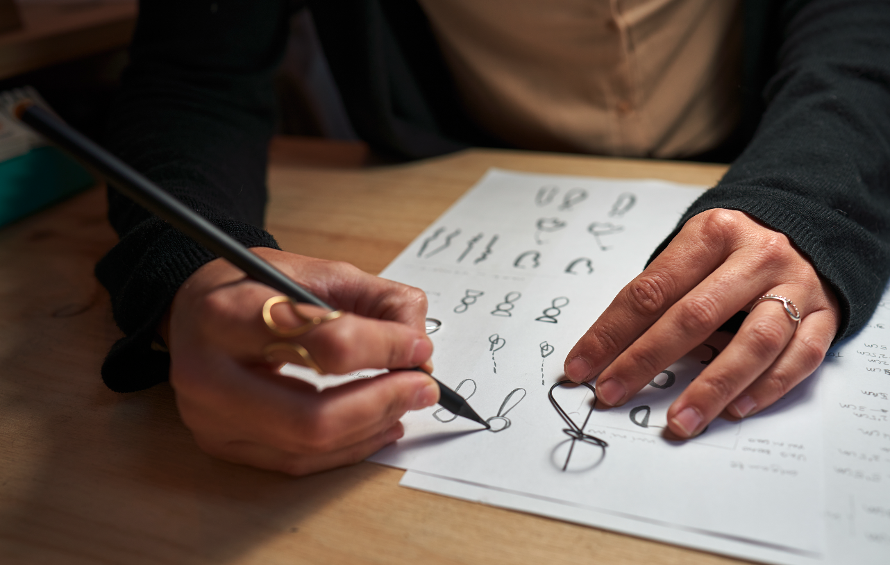
As a designer who is colorblind, my natural inclination has always been towards control. For years, I gravitated towards clean lines, perfect grids, and flat, unambiguous colors. It was a world of mathematical certainty in a field where my own visual perception could sometimes feel uncertain. Perfection was my safe harbor.
But I’ve come to realize that perfection can be a cage. In our pursuit of pixel-perfect vector graphics and flawless layouts, we can sometimes create designs that are technically impeccable but emotionally sterile. They are clean, yes, but also cold and forgettable. I’m on a journey of unlearning—a journey to embrace imperfection and add a little bit of authentic grit back into the digital canvas.
The Era of “Perfect” and Sterile Design
Digital tools have made it incredibly easy to be perfect. We can draw flawless circles, create mathematically precise gradients, and align everything to an invisible grid with a single click. This has led to an aesthetic of digital minimalism that is clean and efficient, but often lacks a soul. It’s the visual equivalent of a room where you’re afraid to touch anything.
The Charm of the Analog World
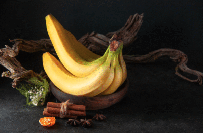
Think about the things we’re drawn to in the physical world. The subtle grain on a photograph shot on film. The unique texture of a heavy, cotton-based paper. The slight ink bleed of a letterpress print. We don’t see these as flaws; we see them as character. They are the fingerprints of the creative process, a sign that a human hand was involved. They have a warmth and an authenticity that a perfect vector can rarely replicate.
How to Add “Soul” to Your Digital Designs
Bringing this human touch into the digital realm doesn’t mean making your work messy. It’s about adding subtle, intentional layers of texture and life.
- Subtle Noise & Grain: A simple, monochromatic noise layer applied at a very low opacity (1-3%) can instantly break up a flat color, giving it depth and a more organic feel.
- Texture Overlays: Find high-resolution images of paper, concrete, fabric, or even dust and scratches. Place them over your design and experiment with blending modes like “Soft Light” or “Overlay” at a low opacity. This adds a tactile quality that invites the viewer in.
- Embrace Off-Blacks and Off-Whites: Instead of pure
#000000and#FFFFFF, try using very dark grays or slightly warm whites. It’s a subtle shift that makes a huge difference in reducing digital harshness.
Before and After: A Quick Example
Before: Imagine a simple portfolio website header. It has a perfectly flat, solid grey background. The headline is in a sharp, white sans-serif font, perfectly centered. It’s clean, legible, and utterly generic.
After: Now, let’s apply our principles. We add a faint noise layer to that grey background. We overlay a subtle paper texture. The headline is now a slightly off-white, making it softer on the eyes. The result is still clean and minimalist, but it now has character. It feels crafted and intentional, not just generated by a machine.
Embracing imperfection is about letting go of the need for absolute control and allowing for a little bit of humanity to shine through. It’s what makes our work not just seen, but felt.