
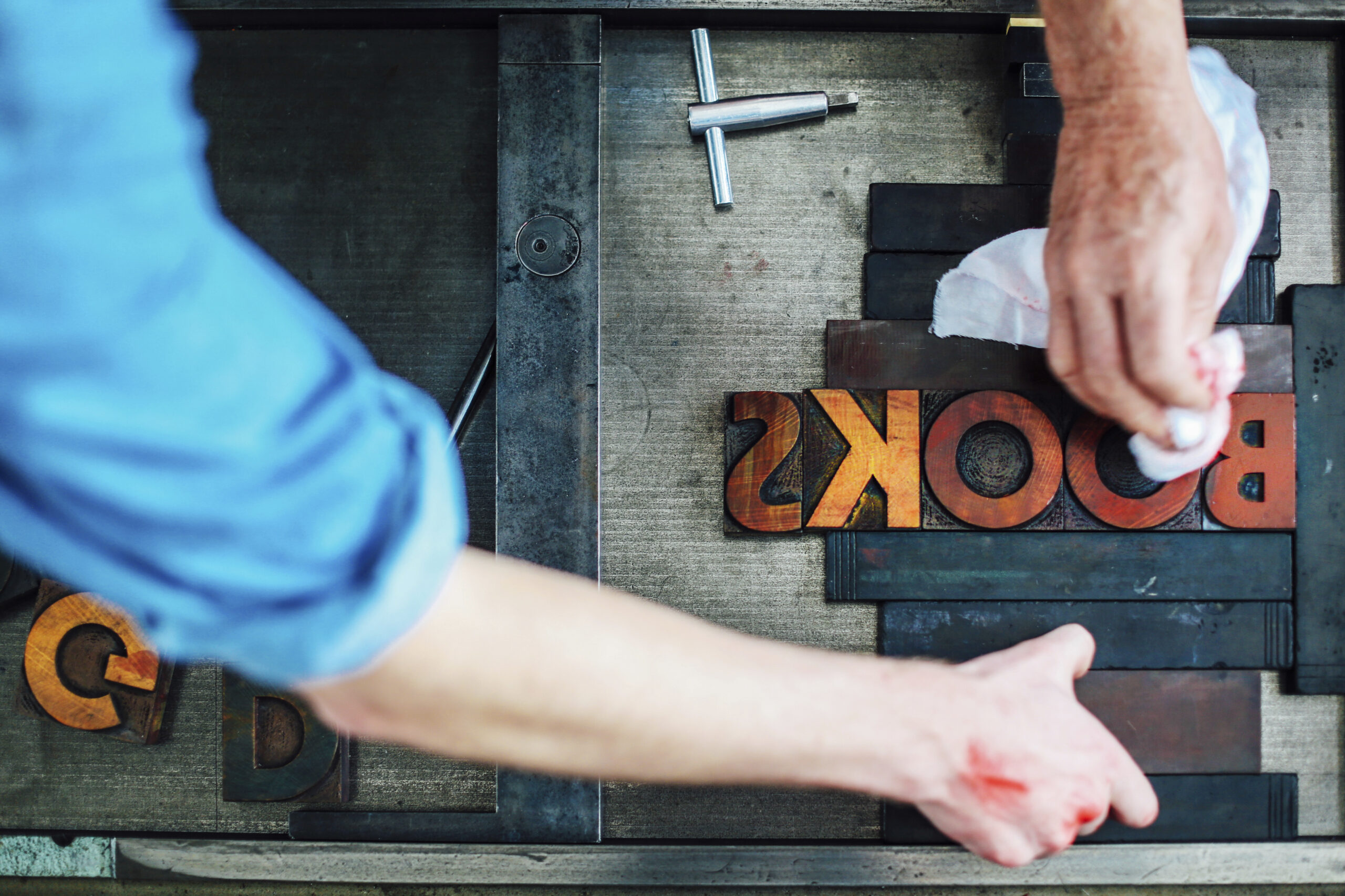
I have a confession to make: I’m obsessed with typography. I’m one of those people who can spend hours analyzing the curve of a single letter, the space between characters, the story that every pixel tells. Yes, I’m the kind of person who has watched the Helvetica documentary more than once. To me, fonts are not just tools for displaying text; they are the very soul of a brand’s voice. They are the clothes it wears, the tone it speaks in, the personality it projects before a single word is truly read.
If Your Brand Could Speak, What Would Its Voice Be?
Think about it. Would it be a deep, reassuring voice of a trusted professor? A crisp, clear, and modern voice of a tech innovator? Or a warm, elegant whisper from a skilled artisan? The typeface you choose is what sets that tone. It’s the first and most fundamental element in defining your brand’s personality.
The Serif Family: Tradition, Authority, and Trust
Serif fonts are the classics. Those little “feet” at the end of the strokes are remnants of Roman inscriptions carved in stone. They carry a weight of history, authority, and reliability.
- Personality: Traditional, trustworthy, respectable, formal.
- Think: The voice of a prestigious university, a high-end law firm, or a luxury brand with a long heritage. Brands like Vogue, Tiffany & Co., and The New York Times use serifs to convey timelessness and gravitas.
- Best for: Brands that want to project an image of establishment, expertise, and enduring quality.
The Sans-serif Family: Modernity, Cleanliness, and Accessibility
“Sans-serif” literally means “without feet.” These fonts shed the decorative strokes for clean, simple, and direct letterforms. They were born out of the modernist movement of the 20th century and feel inherently digital and forward-thinking.
- Personality: Modern, approachable, clean, straightforward.
- Think: The voice of a tech startup, a minimalist lifestyle brand, or any company that wants to feel fresh and accessible. Think of Google, Spotify, and Airbnb. Their use of sans-serif fonts makes them feel user-friendly and contemporary.
- Best for: Digital interfaces, tech companies, and brands that prioritize clarity and a modern feel.
The Script Family: Elegance and a Personal Touch
Script fonts mimic the fluidity of handwriting. They can range from formal and elegant calligraphy to casual and playful scribbles. They feel human and personal.
- Personality: Elegant, creative, personal, sophisticated.
- Think: The voice of a wedding photographer, a craft brewery, or a signature on a piece of art. Brands like Instagram (in its logo) and Cadillac use script to add a touch of personal flair and elegance.
- Best for: Logos, headlines, and any place where you want to add a human, artistic, or luxurious touch. Avoid them for long paragraphs, as they can be hard to read.
The Art of Combining Typefaces
Just like a person’s outfit, a brand rarely relies on a single piece. The real magic often happens when you pair different typefaces. The key is to create contrast and hierarchy. A common and effective strategy is to pair a serif headline with a sans-serif body text (or vice versa). This creates a clear visual distinction between what’s a title and what’s meant to be read, guiding the user’s eye and making the content much more digestible.
Choose fonts that complement, not compete. Let them work together to tell a richer, more nuanced story about who your brand is. Because in the end, every letter matters.